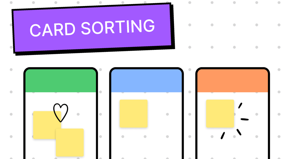
Redefining Page Navigation through Card Sorting for CASA Application
A user-centered research initiative to simplify and restructure CASA’s complex page navigation. By conducting open card-sorting sessions with service agents, I uncovered real user mental models, reorganized features into intuitive categories, and developed a clear, goal-oriented information architecture that improved navigation efficiency by 25%.
4/14/20233 min read
Project Snapshot
Role: Senior UX/UI Designer
Tools: Figma • Optimal Workshop • UXtweak • Miro • Google Sheets
Timeline: 3 weeks
Focus: Information Architecture (IA) Optimization • User Research • Navigation Design
Overview
As part of an ongoing redesign for the CASA internal application, I conducted a card sorting exercise with service agents to understand how they naturally categorize and access key tasks.
The goal was to create an intuitive, efficient navigation system that reflects real user mental models — reducing task time and cognitive load during daily operations.
Problem Statement
The existing CASA navigation had grown complex over time with overlapping labels and an unclear hierarchy. Agents often struggled to locate tools or actions quickly, affecting task flow and efficiency. This led to higher AHT and low engagement between agents and real customers.
We needed to simplify and reorganize the navigation to better align with how users think and work.
Research Goal
To capture agents’ mental models and determine the most intuitive structure for CASA’s core navigation through open card sorting.
Participants & Structre
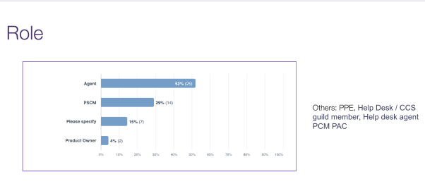
8 live CASA agent managers along with 30+ offline CASA service agents (mix of experienced and new, mixed of roles)
Conducted in a live small group and offline activity
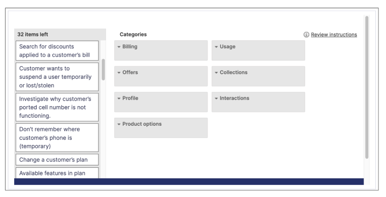
Each participant received digital “cards” representing the main pages and functions within CASA
Created 32 cards representing actions to be grouped in 7 existing categories / main CASA navigation [ also allowing custom category as well ]

Methodology
1. Preparing the Cards
Identified 32 key features within CASA , 7 categories/ Pages (e.g., Dashboard, Customer Info, Payment History, Reports).
Created labeled digital cards in card sorting tool , each representing a unique task or page.
2. Running the Sessions
Used Hybrid card sorting, allowing agents to choose from existing categories and also freely group items if existing doesn’t make sense based on their understanding.
Asked participants to name each group, revealing their internal language and logic.
Captured qualitative feedback on naming conventions and pain points.
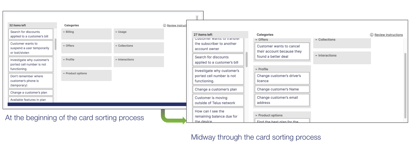
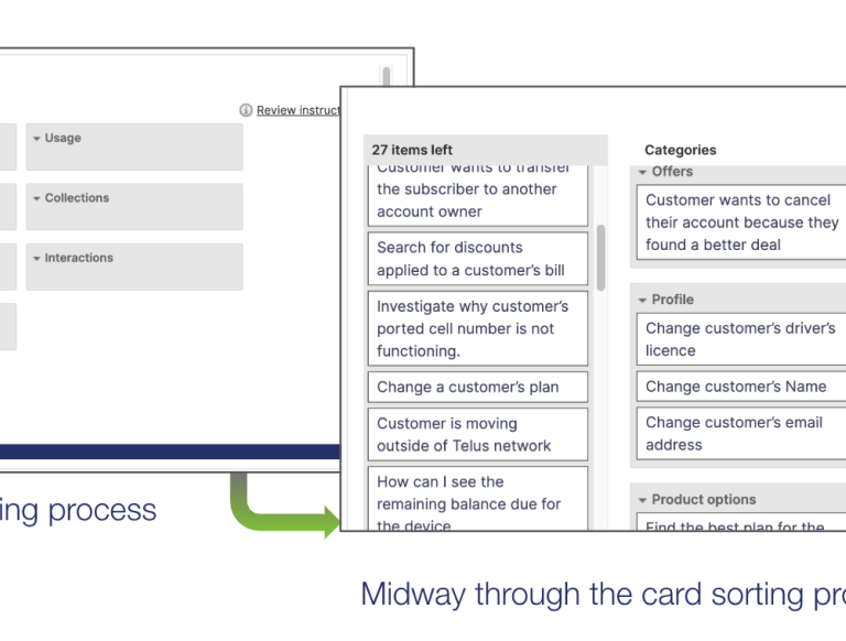
3. Analyzing Results
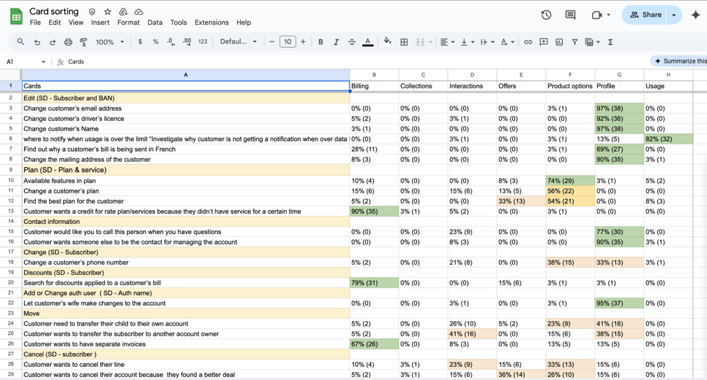
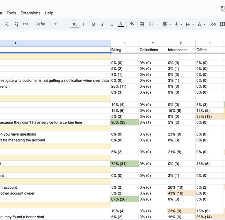
Compiled results across all sessions in Google Sheets and visualized clustering patterns in Figma.
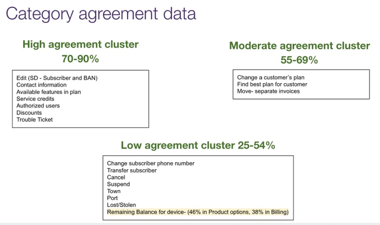
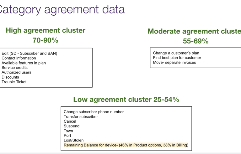
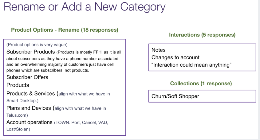
Identified consistent groupings (e.g., “Customer Management,” “Billing,” “Support Tools”).
Highlighted misaligned items — features frequently placed in multiple categories — as candidates for clarification or relabeling.
Findings
Agents grouped functions by task type rather than internal department logic.
Common confusion around terms like “Case Management” vs “Customer Requests.”
Strong preference for action-oriented labels (“Manage Payments,” “Track Cases”) instead of abstract names.
Suggested merging overlapping sections and simplifying global navigation to five main categories.
Results & Impact
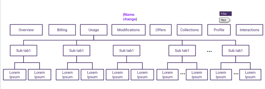
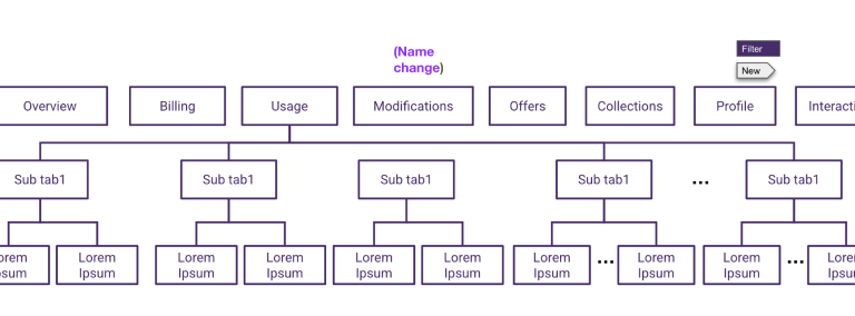
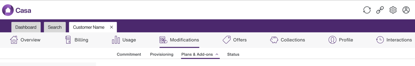
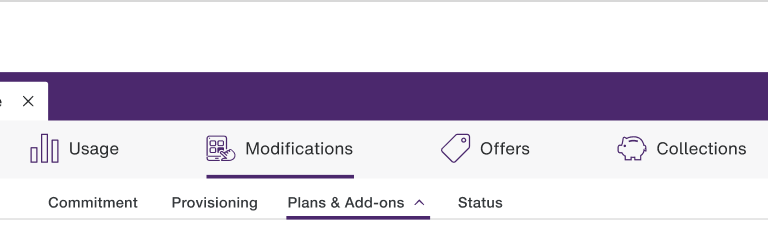
Based on research insights, I proposed a new IA structure with clear, user-focused labels.
New IA reduced average navigation time by ~25% during testing sessions.
Agents reported finding tools “more logically grouped and easier to remember.”
The research provided a validated foundation for CASA’s redesigned interface and content structure.
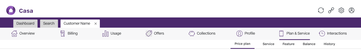
Before
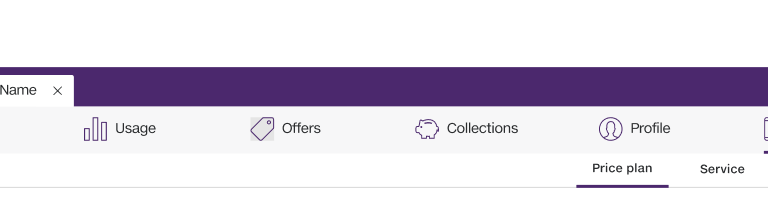
After
Key Learnings
“Users don’t think in systems — they think in goals. Card sorting helped us bridge that gap.”
Real-world input from agents was crucial to simplifying complex enterprise navigation.
Combining qualitative grouping with quantitative frequency analysis built stronger design confidence.
Collaborative testing created buy-in across design and operations teams.
Design
Crafting user-centric experiences with creativity.
About
Testimonials
+1 (519)965-3870
© 2025. All rights reserved.