Data-Driven Content Planning & Page Optimization
As part of my recent role as Content Planner + Designer, I led a data-informed initiative to improve page performance and content hierarchy for a digital retail platform. My focus was to understand how users engaged with different content areas, and to optimize layout and messaging for better engagement and conversions.
9/8/20252 min read


Project Snapshot
Role: Content Planner + Designer
Tools: ContentSquare • Looker Studio • Figma
Timeline: 12 Months
Focus: Page layout optimization, data-driven content decisions, user engagement improvement
Overview
To improve engagement and conversion on key product pages, I leveraged analytics and visualization tools to understand how users interacted with our site content.
By combining insights from ContentSquare heatmaps and Looker Studio product data, I made informed decisions about layout order, banner placement, and product hierarchy — aligning design choices with real user behavior.
Research Goals
Understand how customers navigate and interact with the homepage and category pages.
Identify underperforming content areas (such as hero banners).
Use behavioral and sales data to determine optimal content order and visual hierarchy.
My Process
1. Data Exploration
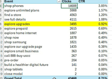
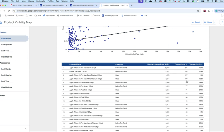
Tools: ContentSquare, Looker Studio
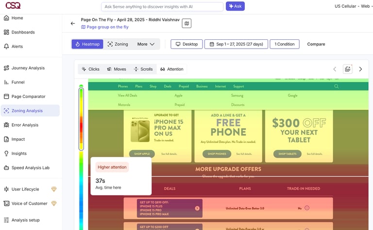
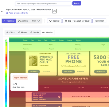
Analyzed heatmaps, scroll depth, and click density to track user behavior.
Compared engagement metrics before and after campaign updates.
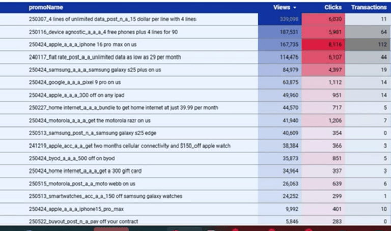
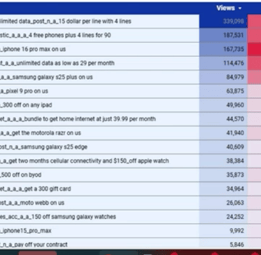
Integrated data with Looker Studio dashboards to see how top-selling products aligned with user interaction zones.
2. Key Findings
Users skipped hero banners quickly, with low engagement rates (<10%).
Product tiles above the fold saw up to 2.5× more interaction than lower sections.
Simplified content blocks improved scroll completion and retention time.
3. Strategic Decisions
Reduced banner prominence to focus on key product content.
Re-ordered page hierarchy based on engagement hotspots (e.g., moving best-selling categories higher).
Simplified on-page CTAs and spacing to guide attention naturally.
Collaborated with developers to ensure updates aligned with brand and performance goals.
4. Results & Impact
+18% increase in click-through to product pages.
+12% improvement in overall session engagement.
Cleaner content flow and faster page load contributed to better user satisfaction.
Key Takeaways
“Numbers tell stories. Design amplifies them.”
Analytics inform creativity — pairing behavioural insights with visual design leads to smarter decisions.
Even minor structural changes can meaningfully shift engagement and sales.
Cross-functional collaboration ensures that design, content, and business goals move in sync.
Reflection
This project strengthened my belief in data-driven design thinking.
Using ContentSquare and Looker Studio allowed me to back every creative decision with evidence — blending my UX instincts with measurable impact.
Next Steps
I plan to expand this process into a repeatable analytics-to-design framework for future content planning projects — integrating behavioural metrics earlier in the design cycle for continuous optimization.
Design
Crafting user-centric experiences with creativity.
About
Testimonials
+1 (519)965-3870
© 2025. All rights reserved.